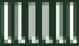
Consider these two screen shots of text of a Ubuntu (size 12) font.


Anti-aliased text is easily recognizable: It looks it's afraid of using #FFFFFF (i.e., completely white pixels). This harms contrast and thus readability.
Furthermore, it also is blatantly inconsistent. Brains equipped with sharp eyes (or brains equipped with crappy eyes equipped with proper glasses) will occasionally stop and wonder whether this letter is really the same as that letter next to it, since they look slightly different (yes, even if you are not inspecting screen text with a magnifier).
Some may argue that anti-alias is good because it makes text continously scalable, by which I mean that you can resize it by any value and it will still look decent, whereas this isn't true for bit maps. And they will be right.
However, we don't really need continuously scalable text; only small enough steps. If you have small (8, 9, 10, 11), medium (12, 14, ..., 24) and huge (36, 72) font sizes, you are pretty much covered. No, you won't really need size 10.2917.
Now, it is true, some font creators invest more in quantity than quality and as such, except for a given size, they will look like crap without anti-aliasing.
So just pick a good font, for example, the Ubuntu font, which also has a great mono-spaced variant.
Convinced? See how to disable anti-alias in all fonts.
By the way, do you know the following criteria that detect a bad font? Just see if these characters are clearly distinguishable, both for normal and for mono-spaced fonts: 1lIoO0,.
If the capitalized "I" looks the same as the letter ell "l", run, run!
You are using a computer after all, no need to squint to read text as you did in university when the Mathematics professor couldn't be bothered to make i, l, comma, etc. look different.